Unwieldy Color Wheels

Students creating color wheels with tempera paint on wet paper.
Color theory is a place where the impossible magic of perception often defies the methods of Western Science. It offers a lot of opportunities for fun experimentation, while being reminded that we all see things differently.
Isaac Newton created a color wheel after noticing the spectrum as light shone through a crystal and began to theorize about the relationships of colors. Scientists and artists continue to investigate and attempt to categorize colors, light, shadow and their interrelationships.
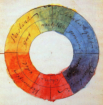
from Johann Wolfgang von Goethe’s Theory of Colours, 1810
Materials Needed:
Red, Yellow and Blue paint - preferably tempera. Acrylic and watercolor work well, too but acrylic will not wash out of clothes, and watercolor can be a bit less brilliant. Red, Yellow and Blue are the primary colors.
A bigger brush - I prefer a round brush but anything will do.
Mixed media or watercolor paper that has been soaked in water. I soak mine in a cookie sheet in a pinch.
A board, cardboard, canvas (or the back of the cookie sheet) to lay the wet paper on until you are finished painting and the paper is dry.
A jar of water to clean your brush. Any container will do.

Richard Waller’s “Table of Physiological Colors Both Mixt and Simple” 1686
For young children: (no wheel - just color mixing fun!)
Place the wet paper on the board.
Ask the kids to paint a big yellow circle on their page. Let them know that the paint will run all over the wet paper and encourage them to enjoy the mess.
Have them “swish and jump” their brushes in their jars.
Ask them to paint one corner of their paper red and let the colors mix to find orange..
Have them “swish and jump” their brushes in their jars.
Ask them to paint the other opposite corner blue. Now all the colors will run together, making green. As they move their brushes around the paper, they will also make purple.
Let them paint as much and as wildly as they’d like.
When they are done, use the back of the paintbrush to carve the child’s name on the paper. Leave it flat to dry.

A college student at Cal State Monterey Bay making a color wheel on wet paper with tempera paint.
For middle school, high school and college students:
Make a color wheel! This (above) may look like a lovely mess, but it’s actually a scientific diagram that students can use to remember what colors are complementary, or opposites on the color wheel. Colors that are opposites on the color wheel react strongly to each other, bouncing and jumping into our eyes when we put them together in art and design.
Red and Green; Purple and Yellow; Blue and Orange - these are the complementary colors. Each primary color has a secondary color as its opposite.
The primary colors are the colors that we can’t create by mixing two colors together. Red, Blue and Yellow can be used to make all the other colors, but we can’t make the primary colors. They just … exist.

Materials needed are same as listed in the exercise above.
Process:
Lay the wet paper on your canvas, board or back of your cookie sheet. You can tip some water off if it’s too wet.
Ask students to draw a circle in pencil on the paper and divide it into thirds. You will have to demonstrate how to divide into thirds - even for college students! :-)
Paint the first pie piece yellow, knowing that the paint will run and not stay in the lines. Remind the students that - no matter what they do- it won’t be perfect, so they can just enjoy. Remind them to start project with the lightest or brightest colors first - so we start with yellow.
Paint the next pie piece to the left red, letting the colors run together to create orange.
Paint the last pie piece blue allowing green and purple to form on either side.
Encourage the students to experiment, adding more of the primary color to the center of their “slice” and seeing how many shades of the secondary colors they can create.
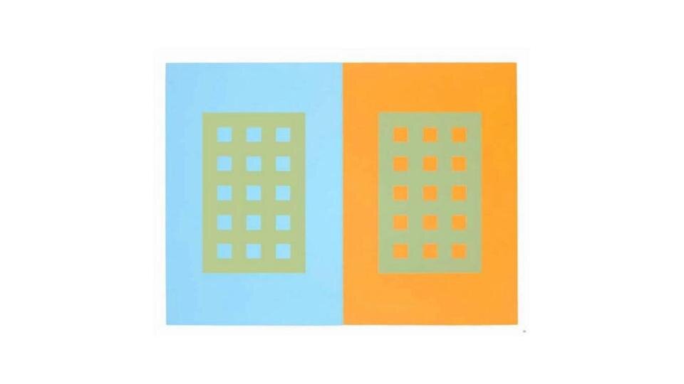
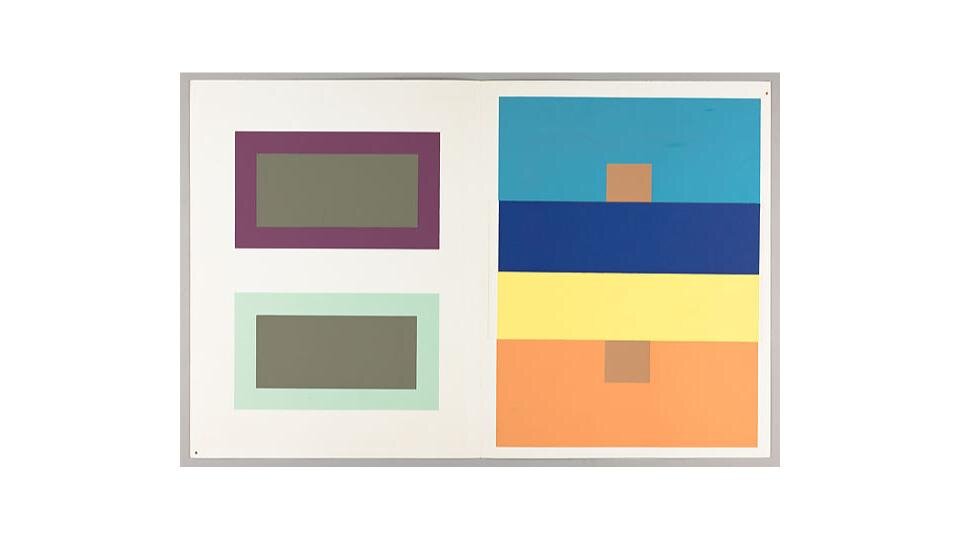
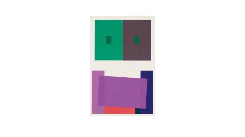
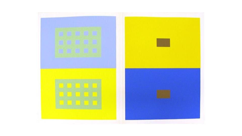
Above - Images from Interaction of Color by Josef Albers, 1963.
For college students:
You can introduce Color Theory, developed by Josef Albers. I bring in a pack of Color-Aid paper, which is what we used to study Color Theory at The Cooper Union in the 1990s.

I love the smell of that silkscreened paper - arranged in no discernible order - each a different color than the next. It’s fantastic! And, expensive. So, I have my students paint a few sheets of their own paper to work with.
We use the color-aid paper (that I collect at the end of class) and then their own paper to re-enact Josef Albers’ transparency exercise. Ask students to squint, quickly sliding one sheet of their color paper over the other. The transparency color will reveal itself where the two papers interconnect.
You can watch this video for more information.
Cultural Ideas:
Every color wheel will be different, and each person will perceive them differently.
This is an opportunity to talk about:
how different people perceive color (and everything) differently.
how different cultures value and honor colors differently.
Finally, this is a good time to consider the scientific impulse to name and sort everything. Does that always work? What are other ways of knowing?
Here are some other resources:
My students read from The Secret Lives of Color by Kassia St. Clair to learn about the cultural and colonial histories of colors.
Download the free App ILoveHue. Play a few levels. How do the colors change as their context changes? This app teaches Color Theory practice so well… and students love it! And, so do I!
For college and high school students: A curriculum on the colonial history of Indigo and its relationship to slavery.
For more on Josef Albers and Color Theory:
https://www.schirn.de/en/magazine/context/josef_albers_interaction_of_color_peter_halley_color_theory/
https://www.brainpickings.org/2013/08/16/interaction-of-color-josef-albers-50th-anniversary/
Here are is a tutorial to help you apply your color wheel knowledge to Photoshop: